typographic-grid
Desinax Typographic Grid (LESS)
LESS module implementing a typographic grid. This is also knows as a horizontal grid, a baseline grid. These types of grid are used to create vertical rythm for the typography in a layout.
It can look like this when applying the typgraphy to a vertical grid.

Table of content
- Documentation online
- Install
- About the grid
- Customizing the grid
- Modify more
- About typography-font-families.less
- License
Documentation online
You can read this README and try out the example files htdocs/*.html by using GitHub Pages.
Viewing this documentation on GitHub Pages makes it easier to both read this documentation and try out the examples on the same time.
Install
You can install using npm to take advantage of version management. Semantic versioning is used to label the various versions.
npm install @desinax/typographic-grid
Or clone this repo and use it as is.
About the grid
The grid consists of two less-files, src/less/typography-font-families.less and src/less/typography-defaults.less.
This is how you can import and activate the grid into your own theme.
/**
 * Import the typographic grid.
 */
@import "src/less/typography-font-families.less";
@import "src/less/typography-defaults.less";
You have now imported the grid, the next step is to activate it.
The first thing is to set the base font for the body element.
// Activate the grid base font
body {
    #desinax-hgrid.font(@fontSizeBody);
}
Next step is to activate all grid styles to the typographic elements, such as h1-h6, p, code, table and so on. You do this by calling another mixin.
// Activate grid and affect all typographic elements
#desinax-hgrid.activateDefaultTypography();
The next step is to optionally enable the to show the grid. This is helpful when one want to check that the typography actually alines to the grid.
// Show the grid
.hgrid .wrap {
    @gridImage: "../../img/magic-number-@{magicNumber}.png";
    #desinax-hgrid.showGrid(@gridImage);
}
Or you can use the alternative showGrid that works more dynamiccaly, without a need of a background image.
// Show the grid
.hgrid .wrap {
    #desinax-hgrid.showGridAlt();
}
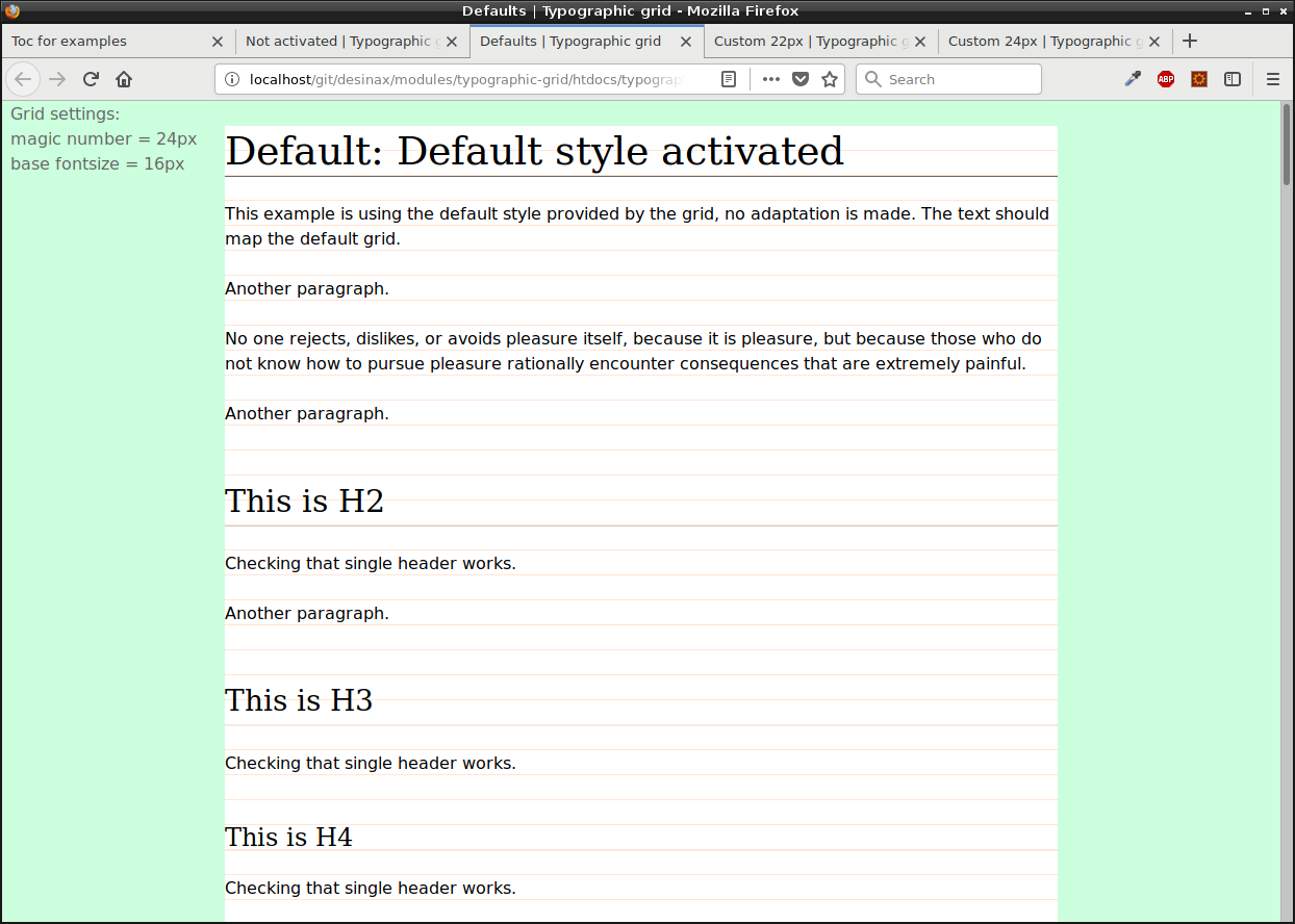
Now you are done. An example showing how this can look like is in htdocs/typographic_default.html. The style used for the example is in src/less/test_typography_default.less.
This is how the example looks like.

Customizing the grid
The idea behind the grid is to select a magic number which all typography should align vertically to.
You can also set the base for the fontsize used.
There are defaults which you can override.
// Magic number and base fontsize
@magicNumber:  24px;  // 22px
@fontSizeBody: 16px;
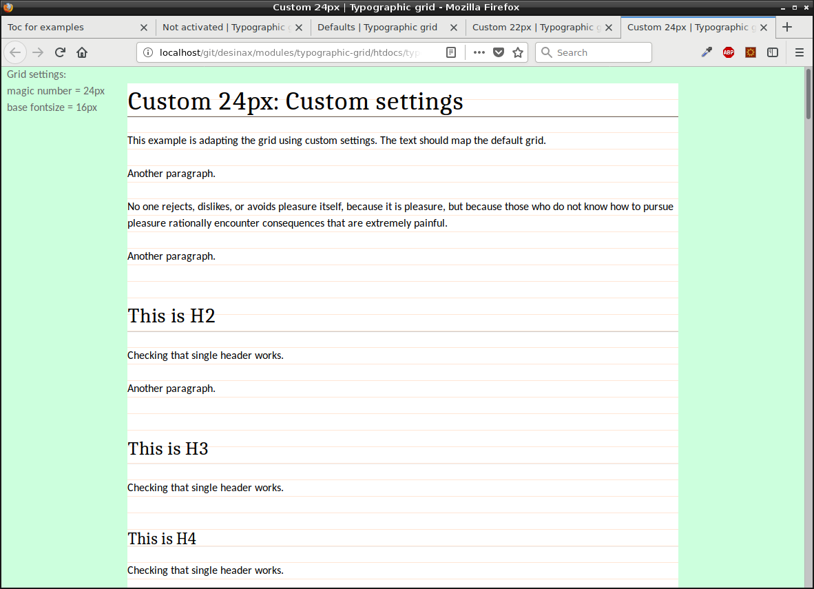
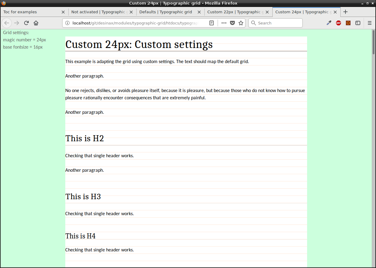
You can review the example in htdocs/typographic_custom_24.html which show a slightly modified grid using fontsize 16px and a magic number of 24px. The style used for the example is in src/less/test_typography_custom_24.less.
It looks like this.

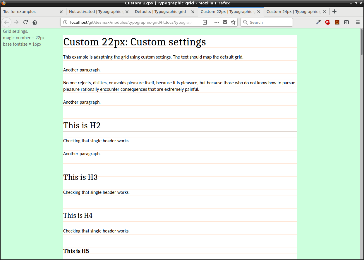
There is another example with the magic number set to 22px. You can review it in htdocs/typographic_custom_22.html. The style used for the example is in src/less/test_typography_custom_22.less.
It looks like this.

Modify more
The basic typography for the grid is in the file src/less/typography-defaults.less. It contains mixins that activate the grid, it contains basic settings for common typographic elements and it contains a set of variables that can be customized by you in your own theme.
About typography-font-families.less
This file contains a set of font families stored in variables. You can review the file in src/less/typography-font-families.less.
Here is an extract from the file. You can use these variables when you customize what font families to use.
// Monospace
@fontFamilyCourier:         "Courier New", Courier, monospace;

// Serif
@fontFamilyCambria:         Cambria, Georgia, Times, 'Times New Roman', serif;

// Sans-serif
@fontFamilyVerdana:         Verdana, Geneva, sans-serif;
In your own theme style you can then set the font families to use in the grid.
// Set font family to use
@fontFamilyHeadings:  @fontFamilyCambria;
@fontFamilyBody:      @fontFamilyCalibri;
@fontFamilyCode:      @fontFamilyCourier;
The variables @fontFamilyHeadings, @fontFamilyBody and @fontFamilyCode are defined, together with a large set of other variables that can be customized, in the file src/less/typography-defaults.less.
License
The license is MIT, review it in LICENSE.
 .
..:  Copyright (c) 2016-2018 Mikael Roos, mos@dbwebb.se