figure
Desinax Figure (LESS)
LESS module for styling the html elements <figure> and <figcaption> with images and image text and neabling css-classes to have images spread over the whol text area or float left/right.
The module also includes styling related to figures encapsulating asciinema and codepen objects.
The module includes basic responsive design for images through media queries and a set of css-classes.
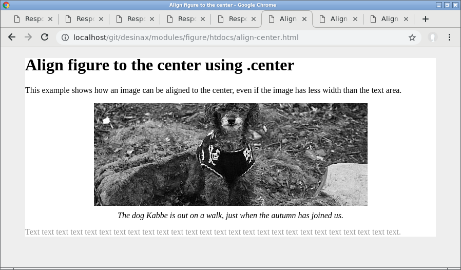
Table of content
Documentation online
You can read this README and try out the example files htdocs/*.html by using GitHub Pages.
Viewing this documentation on GitHub Pages makes it easier to both read this documentation and try out the examples on the same time.
Install
You can install using npm to take advantage of version management. Semantic versioning is used to label the various versions.
npm install @desinax/figure
Or clone this repo and use it as is.
Usage
The grid consists of a set of namespaced mixins which you need to include and activate into your own stylesheet.
Include the module
Here is the files you can choose to include.
/**
 * Figure and figcaption for images and other media using figure/figcaption
 */
@import "asciinema.less";
@import "codepen.less";
@import "figure.less";
Activate the module
Once included you need to activate the style for your own set of classes. This is my general setup.
// Enable style from the module and optinally add customized layout
figure.figure {
    #desinax-figure.figure();
}

figure.asciinema {
    &:extend(figure.figure);
    #desinax-figure.asciinema();
}

figure.codepen,
figure.figure-codepen {
    &:extend(figure.figure);
    #desinax-figure.codepen();
}
The LESS construct :extend() allows a style to build upon a previois defined style. The style for .asciinema() and .codepen() both build upon the style defined by #desinax-figure.figure().
Use the module
Now you can define your html and it will be styled accordingly.
This is html for an image without figcaption.
<figure class="figure">
    <img src="img/kabbe_200x200.jpg" alt="kabbe">
</figure>
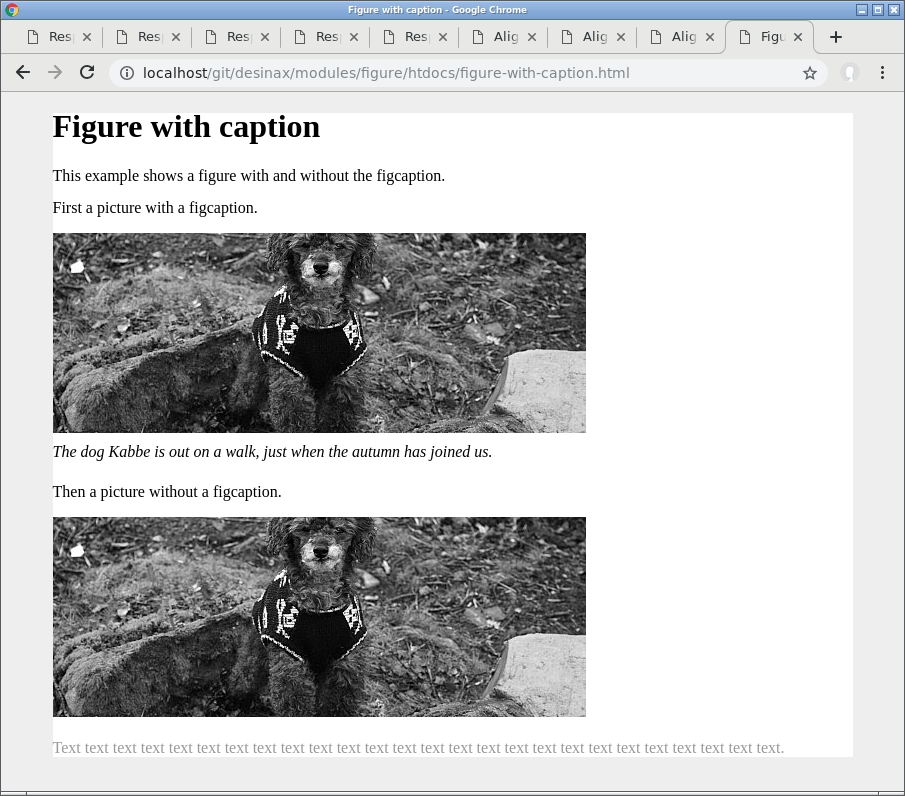
This is a image with a figcaption.
<figure class="figure">
    <img src="img/kabbe_200x200.jpg" alt="kabbe">
    <figcaption>
        <p>The dog Kabbe is out on a walk.</p>
    </figcaption>
</figure>
This is how it looks like.
You might want to add your own special style to adapt the modules base style.
Position the image center, left, right
There are classes .center, .left and .right which enables you to positioning the figure.
The standard layout is that the figure is block-style and aligned to the left.
You might use the class .center to position the figure in the middle of its area, even if the image has less width than the text area.
<figure class="figure center">
    <img src="img/kabbe_533x200.jpg" alt="kabbe">
    <figcaption>
        <p>The dog Kabbe is out on a walk, just when the autumn has joined us.</p>
    </figcaption>
</figure>

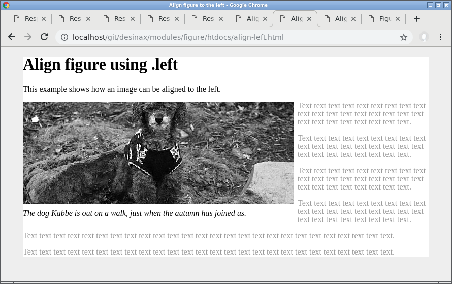
You can position the figure to the left using the class .left and have the text flow around it.
<figure class="figure left">
    <img src="img/kabbe_533x200.jpg" alt="kabbe">
    <figcaption>
        <p>The dog Kabbe is out on a walk, just when the autumn has joined us.</p>
    </figcaption>
</figure>
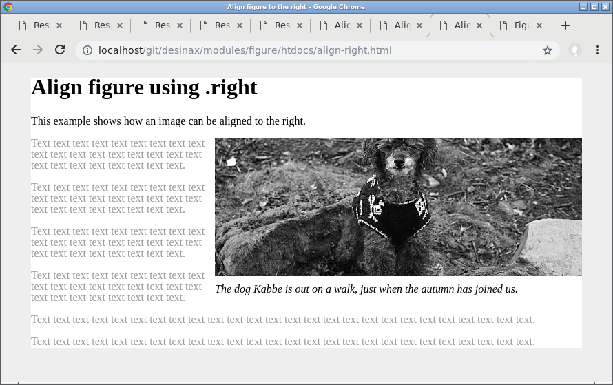
You can position the figure to the right using the class .right and have the text flow around it.
<figure class="figure right">
    <img src="img/kabbe_533x200.jpg" alt="kabbe">
    <figcaption>
        <p>The dog Kabbe is out on a walk, just when the autumn has joined us.</p>
    </figcaption>
</figure>
Responsivness
There is a collection of responsive classes having a media query attached to it. The basic idea is to let the figure module aware of the max width of the text area and relate it to the standard width of each figure.
This only relates when using the classes .left and .right when the text flows around the figure.
The following classes exists.
| Class | Image width |
|---|---|
.w25 |
The image has default a width to approximate 25% of the text area. |
.w33 |
The image has default a width to approximate 33% of the text area. |
.w40 |
The image has default a width to approximate 40% of the text area. |
.w50 |
The image has default a width to approximate 50% of the text area. |
.w67 |
The image has default a width to approximate 67% of the text area. |
The style applied does in general look like this, using the class .w50 as an example.
&.left,
&.right {
    @media screen {
        @media (max-width: round(@maxContentWidth * 2 / 3)) {
            &.w50 {
                margin-left: 0;
                margin-right: 0;
                float: none;
                img {
                    width: @maxContentWidth * 2 / 3;
                }
            }
        }
    }
}
You make the figure module aware of your @maxContentWidth during setup. There is an optional argument you can send when activating the figure module.
// Enable style from the module and optinally add customized layout
figure.figure {
    @maxContentWidth: 960px;
    #desinax-figure.figure(@maxContentWidth);
}
Now a set of media queries act on each class and modify its layout for responsive purpose.
Here follows a set of representations showing how the resposive class may affect them image.
This is the initial look, the browser is wider than the @maxContentWidth and the images is set to have the class .w50 since they initially take up half of the text area.
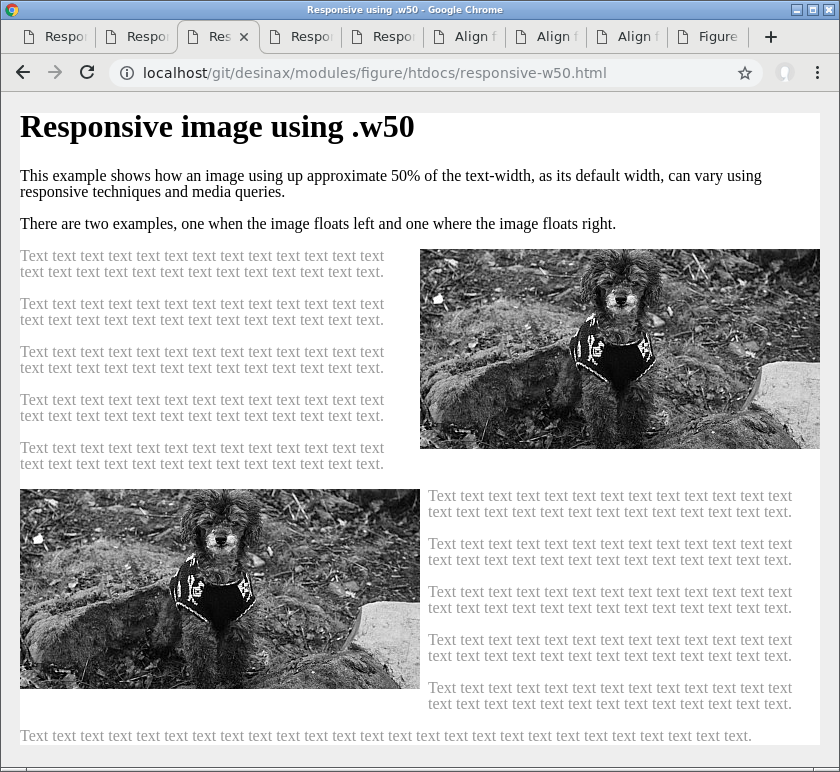
The text flows around the image while the browser is ledd wide, the media query is not yet active.
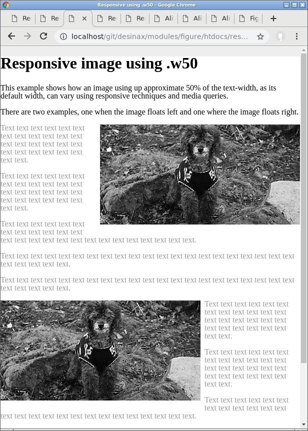
Now the breakpoint is reached for the media query and style is applied so the image takes up the full space and text does not flow around it.
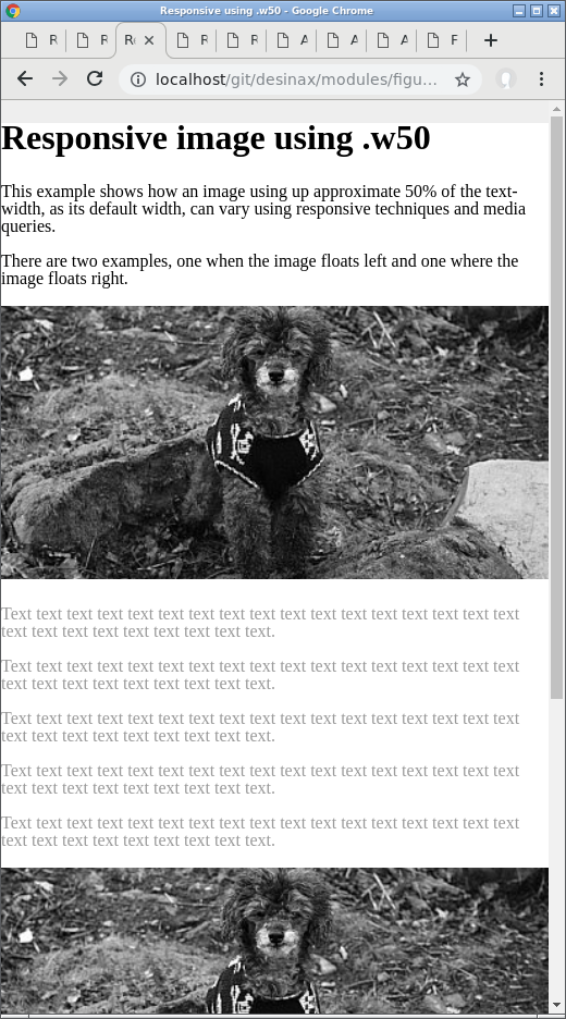
There are a set of examples, where you can see how it works, in htdocs/, using the various responsive classes.
License
The license is MIT, review it in LICENSE.
 .
..:  Copyright (c) 2016-2018 Mikael Roos, mos@dbwebb.se